Colour Psychology
Generally speaking, people have their personal opinion on colour. Through scientific observation such as, Angela Wright’s interview with Chris Bailey I have been able to tell how some colours effect mood, concentration levels and balance in your mind set. By using this information you can be aware of how your brain works around certain colours. For a study, this is a key element, being able to concentrate and having motivation is very important.
Black can be seen as depressing, as it absorbs light and is generally associated with death and mourning. Having such a dull colour in a study would be detrimental to your motivation to do work. I would steer clear of this for blocks of colour such as, walls or floors and stick to using it as a colour to break up other colours.
White is a diverse colour, it’s linked with serenity and pureness. If it is used in large quantities it’s known for stark and cold demeanor and giving a sterile and bland feel. White is a good base colour, as you can add brighter colours and allows for everything to fit together.
Red if used too much can be seen as an aggressive colour. But when used in moderation it is a warm and comforting colour.
Blue is a calm, serene colour. It is used as a conservative colour it bring a peaceful and secure vibe. It is a great colour in which helps you concentrate. If it is over used then it can cause sadness or aloofness. So to make sure this doesn’t occur break the colour up and allow for blocks of other colours.
Green is another colour which helps you concentrate, it offers tranquility and relieves stress. Green can be a colour which you love or hate so using it in small amounts may apply to you. I think that it is a good colour to use to break things up, especially with the many different shades you can have it in.
Yellow is bright and intense, it grabs your attention. It is a warm colour, it is best to use it in small amounts to keep the study it warm and appealing. If used too much it can be quite an abrasive colour and cause visual fatigue.
Purple is an imaginative and spiritual colour. As it is quite rare in nature it’s seen as an intriguing colour. It’s known to be a colour which you love or hate. I think a splash of purple in a study will encourage uniqueness and help you with creative ideas.
Brown is quite a diverse colour, it can be quite an unattractive colour, it’s very earthy and solid colour. Although it can seem dull and drab, it can actually bring security and dependability. I think that materials such as timber will be perfect for the use of brown, as it comes in many different shades.
Pink is a calming colour it is associated with red because it can be bright and if used too much it can also come across as aggravating. This colour would be best for accents in the room. It would help keep the calmed ambiance which is beneficial when you are concentrating for long periods of time.
Orange is a controversial colour, like purple. It grabs your attention and can be uplifting. But used too much it can be overwhelming. Used at a minimum it could be beneficial for your mod and motivation levels.
Painting the Walls and Ceiling
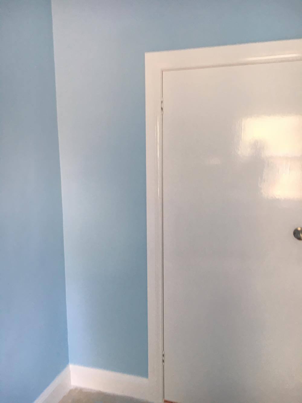
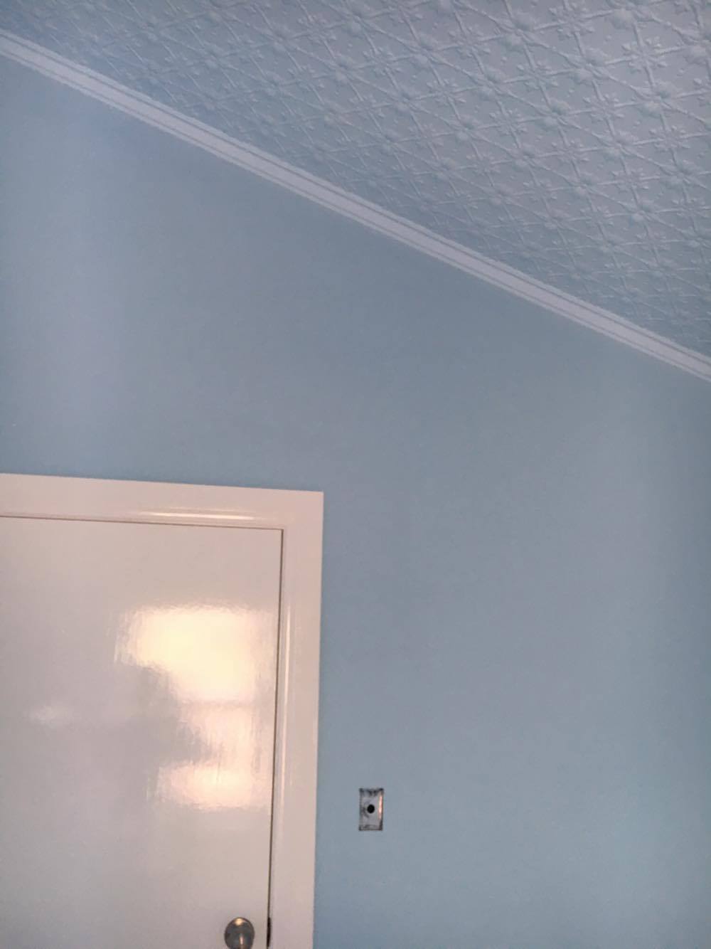
High saturation colours are more stimulating. Keep this in mind when choosing a colour for the walls. Low saturation colours are less simulating, somewhat soothing. This is good for the ceiling as it breaks it up from the high stimulating colours. (Wright, 2013) As mentioned, blue and green are the best colours for productivity, which is a bonus as blue is my personal favourite. When going to ‘Solver Paints’ I was able to select a number of samples to experiment with. I could have bought sample paint pots which would have allowed me to paint sections of the wall to get a visual idea, but for a cost. Whereas, cardboard swatches gave me enough idea of what the colours would look like. After much consideration regarding the level of saturation, I was able to narrow it down, deciding to use sky blues called, ‘Atmospheric’ (walls) and ‘Early Dawn’ (ceiling). Along with the colour ‘Breeze’, a fresh white for the window, skirting, solid door and architraves. This contrasts nicely and breaks up the blue with a neutral colour.
After figuring out the colour of the room, I was able to start thinking about what furniture I would need. Refer to my post ‘Furniture’ to see what I chose.